Unveiling the True Scale: The New World Map Revolution
The world as we know it might be a bit of a deception. For centuries, the maps that have graced classroom walls and adorned atlases have been anything but accurate. The Mercator projection, a longstanding staple of cartography, has been misleading generations about the true size of our planet's nations.
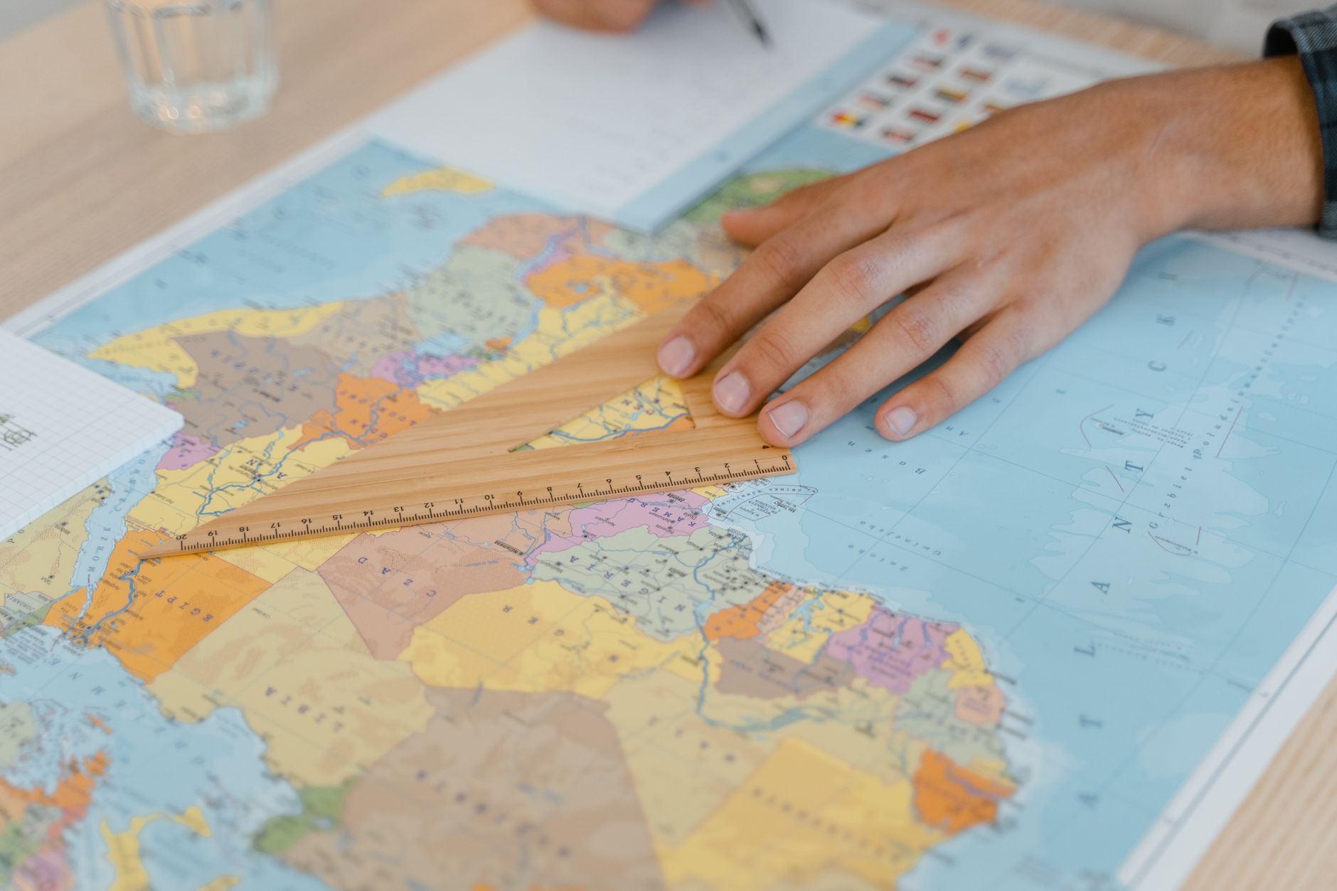
Enter the new interactive world map, a digital tool designed to challenge these deeply ingrained misconceptions. This map allows users to drag, drop, and even rotate countries, providing a more accurate representation of their actual sizes. One of the most startling revelations from this exercise is the true scale of Africa. Often depicted as comparable to Greenland, Africa is, in reality, a behemoth that could comfortably contain multiple nations within its borders.
Distortions of the Mercator Projection
The Mercator projection has been useful for navigation, given its ability to represent straight lines as straight courses. However, it introduces significant distortions when it comes to area. As one moves away from the equator, landmasses appear larger than they truly are. Greenland, for instance, seems to rival Africa in size, yet it is only about 1/14th of Africa's actual area.
Such distortions have far-reaching implications, shaping not just academic understanding but public perception and geopolitical attitudes. By perpetuating these inaccuracies, traditional maps have inadvertently skewed our global perspective.
The Power of Interactive Mapping
This new interactive map invites users to explore and understand these distortions firsthand. By manipulating the outlines of countries, users can visually grasp the disparities in area and size. It is a potent reminder that our conventional views of the world may not hold up under scrutiny.
For educators and students, this tool offers a refreshing means to engage with geography. It encourages critical thinking and sparks curiosity about the world beyond the confines of traditional map boundaries. In an era where digital technology increasingly informs our understanding, such innovations are invaluable.
Ultimately, this map does more than correct cartographic errors. It offers a more equitable representation of the world, challenging us to reconsider the narratives we've long accepted. A simple adjustment of perspective, it turns out, can alter not just how we see the world, but how we understand our place within it.